Real Estate Agents
Branding for Real Estate Agents has become a bit of a passion of mine. I truly enjoy getting to know the agent, and what their unique perspective and skills are, before creating a visual identity to match it.
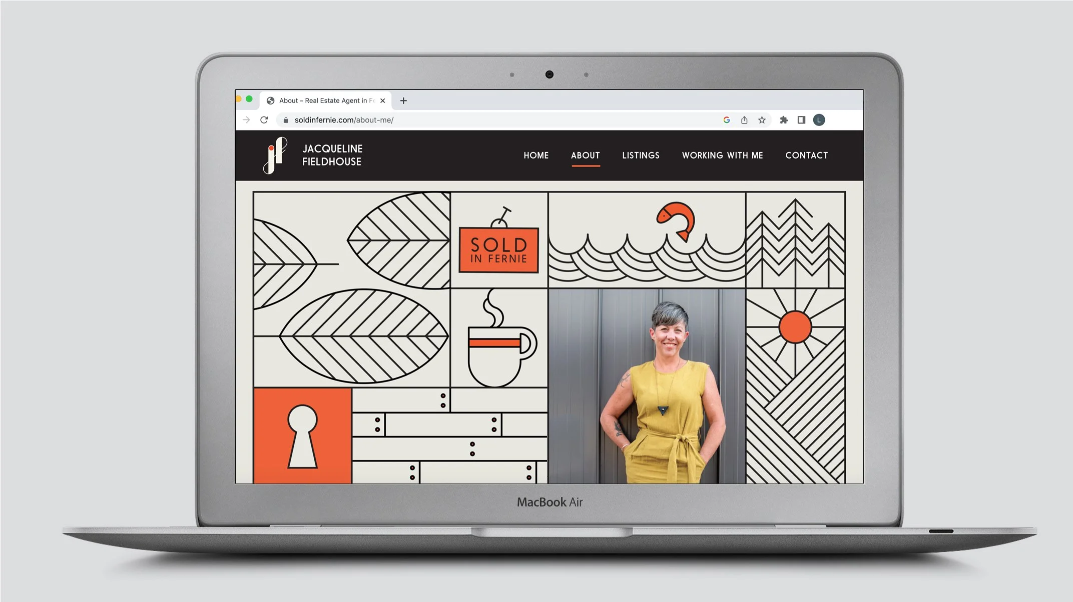
Jacq Fieldhouse
Brief
A stand-out, bold yet casual graphic identity for Jacq Fieldhouse, realtor and general lovely-woman around town. The branding needed to be flexible in order to be applied across a lot of different formats.
Solution
An illustration-heavy brand that is recognizable, bold and modern, depicting Fernie lifestyle and house details. Part of the graphic identity is also a monogram from her initials.
The website is a great collaboration with WigWam Media
Business Cards
Post Cards
Wrapping Paper
Local Print Ads
Listing Flags
Lawn Sign
Website Design
Instagram Posts
Art Direction for Photoshoot
Artwork for Cinema Animation


Miriam Leishman
Brief
Miriam needed branding to solve two problems; a cohesive brand that could roll out across several applications, and facial recognition. Moving to Fernie for the Mountain lifestyle, many knew her as a ski coach (something she is still active in) but not a realtor.
Solution
A visual identity with a focus on elegance and simplicity teamed with a series of candid photos (a long shot from traditional realtor photos) that shows Miriam in her work environment.
Business Cards
Post Cards
Wrapping Paper
Local Print Ads
Hockey Arena Ad
Note Pads
Instagram Posts


Justin Hughson
Brief
Justin Hughson brief was clear - he was passionate and excited about helping buyers relocate to the Elk Valley for the same reasons he did, to take part in all the recreational activities the area has to offer!
Solution
Focusing on the Elk Valley as more than a home, with access to endless adventures, we built the brand around the tagline “I find your property. You find your adventure.”
The visual identity utilizes naturals and greens in the colour palette, a graphic illustration of an elk (Elk Valley - wink wink) and a topographical map of the local area.
Business Cards
Instagram Posts
Presentation Folders
Site Signage
Print Ad
Letterhead


Nick Harrison
Brief
Energetic, young and an absolute master in clear, prompt communication - Nick came to me wanting a brand that has a strong connection to the Shuswap area, a youthful energy but also clear and professional feel. He grew up in the area and recently moved back.
Solution
The mark in the logo combines his initials N & H and hints at a contemporary heritage. (Nick's family has deep roots in the community).
We developed the two part illustrations to showcase the beautiful buildings in the area along with natural and cultural aspects like wildlife or seasonal objects such as beach umbrellas and skates.
We wanted to avoid language that felt too mature or stuffy, so the brand voice consists of short, clear and slightly cheeky taglines.
Business Cards
Instagram Posts
Hockey Rink Ad
Movie Animation
Billboard Sign
Website


Jenna Begin
Brief
Jenna is a straight-talking, funny and very likeable. Having relocated from Fernie to the coast of BC she needed new branding that better connected with her new home.
Solution
A visual identity that is bold, modern and aggressive (in the best of ways!) teamed with illustrations of the surrounding nature. The natural colour palette helps soften the look.
Business Cards
Instagram Posts
Post Card


Ryan J. Frazer
Brief
Ryan J. Frazer is a very successful realtor (and now owner to the REMAX brokerage in Fernie), and was the first real estate professional to realize the importance of standing out. He was very open to how, but wanted a new graphic identity to differentiate himself from other realtors in the area.
Solution
The branding reflects his business approach - no-fuss, straightforward yet approachable and friendly. A simplified icon of the local mountain range became part of the brand along side graphic illustrations of the surrounding area. (The branding has gone through a 2.0 treatment since it was designed in 2016.
Business Cards
Local Print Ads
Lawn Sign
Initial Website Design
Instagram Posts
Bus Shuttle Wrap
Tent (Event)
Koozies
Presentation Folder
Post Card


