Health & Wellness
Health and Wellness brands is something I have picked up in the last few years and I really enjoy working on them! Not that different from restaurants in the sense that they require a broad range of applications as there usually is a physical space along with print and an online presence.
Carbon Fitness
Brief
When a client approaches you with years of thinking and planning around their business idea the job is pretty easy! Carbon Fitness just needed a visual identity to tie it all together.
Solution
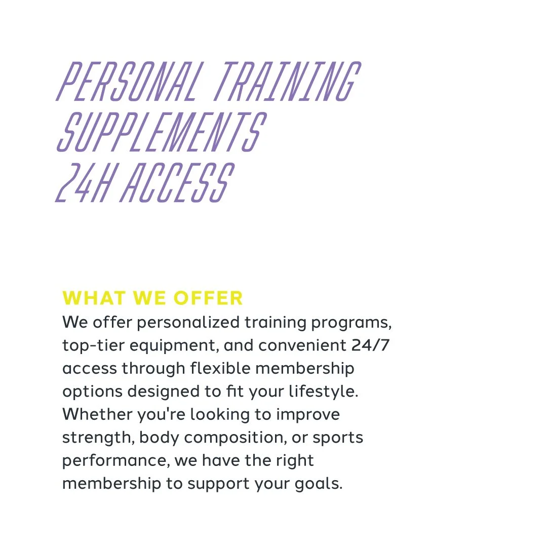
Carbon - a building block of coal, ties in nicely with the coal-mining history of Fernie, where the gym is located. “Strength in Every Element” - alludes to the fact that Carbon is a primary component of all life on Earth and therefore people as well.
The visual identity needed to capture the energy and structure that Carbon Fitness provide its clients, along with showcasing one of the core beliefs - inclusivity.
Photos that were Art Directed by My Friend Pike and shot by Jamie Inman, tied it all together and further showcased the open, inclusive and guided strength training Carbon Fitness offers.
A flexible system was created, containing several logo versions, with the C mark anchoring them all. The colour palette is composed of a Carbon grey, white, purple and a vibrant neon yellow/lime. The was also brand is translated into a responsive website.
Business Cards
Post Cards
Key Cards
Signage
Window Graphics
Website
T-shirts
Banners
Tent


Fernie Pilates
Brief
Coming Soon
Solution
Coming Soon
Business Cards
Website
